Connecting the Dots
Founded by physicians, neuroscientists, researchers, and software engineers, Blackfynn was on a mission to redefine how therapeutic drugs and devices were created. The idea was that therapeutics could be improved through better data and better software. At the core of this idea was a piece of software that helped neuroscience researchers store, manage, and collaborate on the data used in their research. The idea that curated data + better software + experts in the field was starting to grow and Blackfynn wanted a new identity that would help bring the company into the next phase of its evolution.
Born out of necessity from the day-to-day rigors of managing neurlogical research data, the team at Blackfynn had no sense of their brand identity. They had a simple logo with no clear cohesive strategy. After joining the team, one of my first opportunities was to help redefine the brand identity at Blackfynn. With no budget to hire an agency, I stepped the team through some exercises to help define some brand characteristics that could help set it apart from the sterile world of therapeutic and clinical software companies.
We defined Blackfynn as an authoritative leader: our team of experts were taking a new approach to solve old problems and we weren't afraid to show it. We're innovative and forward thinking: pushing the field of collaborative science, taking chances to help move the industry forward. Blackfynn is bold: our partners are big organizations with big problems that we're there to help solve. Finally, we're serious-ish: at the end of the day we're all people who love what they do and have fun doing it. It's okay to let that shine through, but we know when to get real.
Looking to move away from the typical images of stylized brains or electrical bolts that others in the space coopted as logos, the Blackfynn mark boldly stands out in the crowd. Borrowing from Blackfynn's foundational elements of collaboration and connectivity, simple lines help to "connect the dots" - forming an distinctive, abstract monogram.
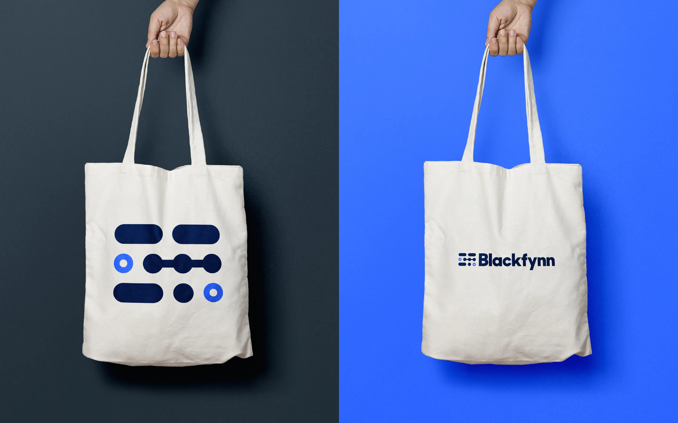
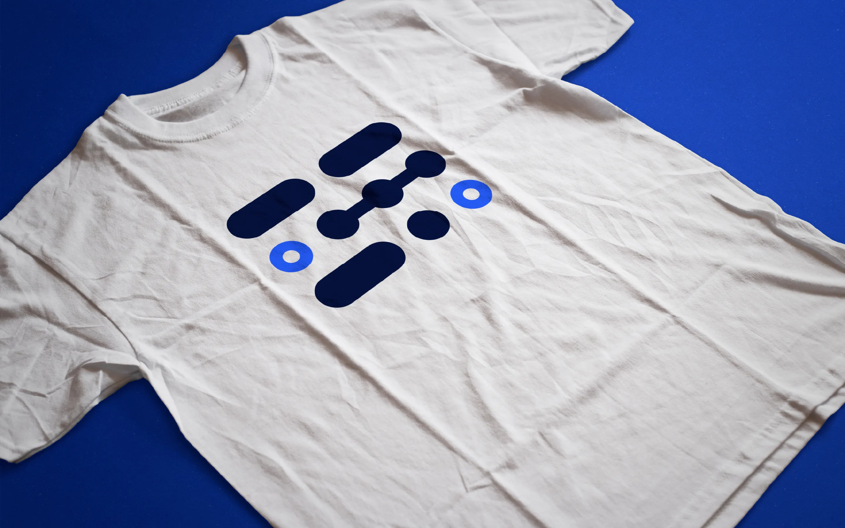
With the logo in place we needed visual elements to help compliment and reinforce the idea of "connecting the dots". Working with Greg Christman, individual elements of the mark are used in each illustration to create a cohesive visual language. Accent colors are bold and placed in visual elements to help accentuate the core message of each visual element and to add depth. The slight playfulness of the icons allow us to inject a bit of personality and a break from the serious subject matter.